

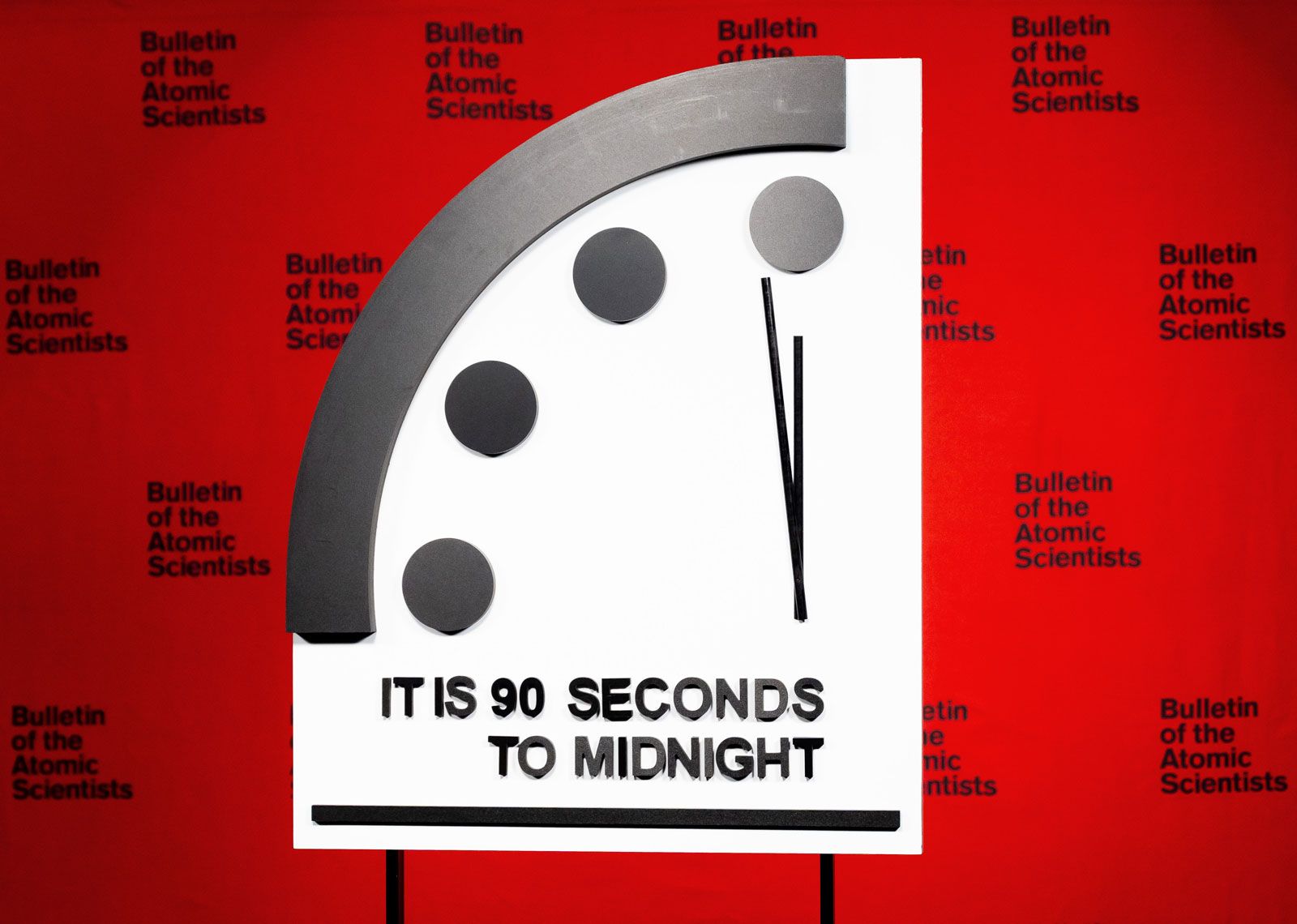
Well, I reckon you’ve heard about that fancy “map of the end of the world” and what they call the Doomsday Clock. Now, don’t go thinkin’ that it’s just some kind of map like the ones we use to find our way to town. Nope, this one’s got a whole lotta gloom and doom behind it, if you ask me. Folks who know about such things, them smart scientists, they’ve got this clock that shows us just how close we are to somethin’ bad happenin’. And, I tell ya, it’s closer than it’s ever been—just 90 seconds to midnight!
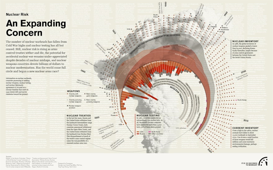
Now, don’t go scurrying off, thinking this ain’t important. You see, every year they move that clock closer or farther from midnight, dependin’ on how things are lookin’ in the world. And lately, things ain’t lookin’ too good. A while back, in January 2023, them scientists said we were only 90 seconds from disaster, which is the closest it’s ever been since they started keepin’ track in 1947. That’s right, 90 seconds! Just think about it—how much time you got in 90 seconds? Barely enough to catch your breath!


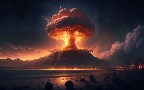
So, what’s the big deal with this clock, you ask? Well, this here Doomsday Clock ain’t just some kind of fancy gadget. It’s a symbol, see? A symbol of how close we are to somethin’ real dangerous, like a nuclear war. Now, if you’re like me, you probably ain’t too clear on all them big words, but the long and short of it is, a bunch of smart folks set that clock up back in the 1940s, right after them big bombs went off in places like Japan. They were worried, and rightly so, that one day things might go too far, and before you know it, we’d all be in a heap of trouble. Ever since then, the clock’s been tickin’, tellin’ us just how much longer we got before the whole thing might come crashing down.
But there’s more to it than just a clock. There’s this thing they call the “map of the end of the world,” and it’s been makin’ the rounds too. It’s not just some big fancy map of where you’re gonna go when the world ends (although, now that I think about it, that’d be nice to know, huh?). Nope, this map’s about the whole world, and how the folks who know about it think things might shake out if we don’t watch ourselves. Some smart people say the world map we’ve been lookin’ at since we was young’uns ain’t even right! Can you believe that? We’ve all been lookin’ at the Mercator map, but it don’t show the world the way it really is. It’s all twisted up, makin’ some countries look way bigger than they really are. They say the AuthaGraph map’s a lot more accurate—it shows the world the way it’s really shaped. It ain’t just about getting the right proportions, but about makin’ sure we know where we stand in this big ol’ world of ours.
Now, I ain’t one for fancy science talk, but there’s somethin’ to be said about these maps and clocks. They’re reminders, you see? Reminders of how fragile things are. And this “map of the end of the world” makes you think about just how quickly things could change. The way I see it, we might be sittin’ pretty now, but them maps and clocks tell us we better be payin’ attention, or else one day, we might not be able to turn back.
And don’t think this is just some far-off problem. Oh no, this affects all of us. You don’t have to be a bigwig scientist to understand that. You can feel it in the air, can’t you? The world’s a mighty complicated place these days, and every time I turn on the news, it seems like there’s more and more bad news—floods, wars, wildfires, and all sorts of other things. So, when them folks talk about a map or a clock that shows us where we might be headed, I take a minute to stop and think, maybe even pray a little, that we can make the right choices before it’s too late.
Some people might laugh it off, sayin’ it’s just a bunch of doom and gloom. But when you look at that clock, when you look at that map, it makes you wonder. If the world really is on the edge, what can we do about it? I don’t know if I’ve got the answer, but I reckon it starts with us all doin’ our part, takin’ care of the land, treatin’ each other right, and maybe just slowin’ down and takin’ a good look at where we’re headed. It’s a big ol’ world, but sometimes it feels mighty small, don’t it?
So next time you hear about that Doomsday Clock or a map that shows the end of the world, don’t just brush it off. Take a moment and think about it. Maybe we all need to start makin’ some changes before that clock ticks down to midnight.
Tags:[Doomsday Clock, End of the World, World Map, AuthaGraph, Doomsday Predictions, Nuclear Threat, Global Issues, 2024, World Proportions, Climate Change, Global Warming]


